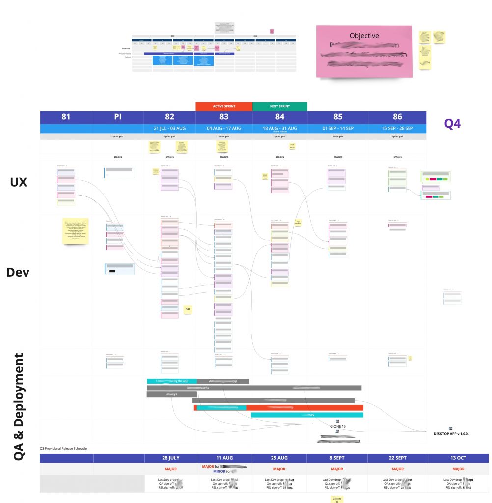
I’m quite pleased with the latest online Miro PI Planning board which took at least five or six attempts to get to this stage.

It’s the closest we’ve got to in terms of Dual Track Agile, with UX working a sprint ahead (or often more than one, if there is some conceptual investigation to be done). So now UX has a swimlane and it’s helpful to use the arrows to show how the stories are connected.
QA often has stuff to do beyond just testing and we wanted to visualise that as well.
At the bottom is the release plan. I wanted to make sure that all the work coincides with the release plan and to make that as visual as possible – the green and grey bars indicate how long a particular feature (or outcome) will take and then it’s linked (with an arrow) to a release. This has helped with decision making so much, just simply visualising the work to a release. Only two releases this quarter.
At the top are sprint goals. The remaining sprints are still quite bare with just a few notes. The objective is very clear (in bright pink) so that we can ensure that everything is aligned with this single objective.
There is also a basic product roadmap at the top for stakeholders to know what’s coming up potentially in the next quarter.
